

It is possible to get deeper insights into your eCommerce business with simple, user-friendly, and editable forms. They enable faster and more convenient analysis, which you can then use to power your business forward by making intelligent decisions.
There are a variety of different types of forms that can be beneficial for your online business. Some of the most useful include:
- Payment forms
- Lead capture forms
- Lead generation forms
- Sign-up forms
Here are three best practice tips to improve the forms on your eCommerce site.
1) Ensure forms are easy to complete
An important element of form best practices is to ensure that a form is easy to complete by potential customers. Complicated, fiddly forms are likely to result in people visiting the page and leaving before filling out the fields. The aim is to make it as easy as possible for users to complete the desired action, in this case, filling out the form.
Some important points to consider when creating an effective form are:
Keep forms as short as possible and be selective with the fields you ask for
While it can be tempting to ask as many questions as possible in order to gather more information, we advise that you do the opposite. Only ask for the information you need.
Requiring a customer to invest more time and effort on a form can result in them abandoning the form. The goal when making forms is to reduce as much friction as possible; this increases conversion rate and reduces churn, turning potential customers into existing customers.
Give optional fields that customers can choose to either fill out or not fill out
Adding extra fields is not always a bad thing and there are ways in which you can ask for more information, without creating huge amounts of friction. One way of doing this is by making non-essential fields optional.
This essentially means that necessary fields, such as name and email address, need to be completed, whilst beneficial, but less important fields, such as address or phone number are optional.
Optional fields give customers the ability to choose how much information they provide, and this can often make them feel more valued, and less pressured.
Allow autofill
As mentioned above, consumers want forms to be as easy to complete as possible, and enabling autofill is a great way of achieving this.
Autofill makes it possible for certain fields to be automatically filled out if the information requested is already stored on the customer’s device. This makes filling out a form much quicker and easier.
The benefit of enabling autofill is that it doesn’t have any negative impact on the form itself and businesses do not need to compromise (having less fields can feel like a compromise in some situations).
Ensure forms can be filled out on mobile devices
The way people use the internet is changing, and it is becoming far more common for people to use devices such as phones or tablets instead of desktops; interestingly, 69% of internet users shop on their phone.
As a result of this change, your eCommerce store needs to make adjustments to ensure that your eCommerce website design is user friendly. The chances are, if someone cannot complete an action on their phone, they will use another website that does enable them to. Therefore, it is an eCommerce best practice that all forms are optimized for mobile devices.

Source: Paperform
2) Make forms aesthetically pleasing
The content of a form is not the only thing a brand should keep in mind. The form design also has an impact on how consumers respond to it. According to studies, 75% of consumers admit to making judgements about a company’s credibility based on the appearance of their website. A successful eCommerce website is easy to navigate whilst still being pleasing to look at.
Although forms are only a small part of a website, it is important to note that they are the element that requires the most from a customer. The majority of a website just requires a customer to browse and not make any decisions. However, forms ask for customers to commit and fill out information.
Best practices for ensuring forms are aesthetically pleasing include:
Consider color choice
The colors used are arguably one of the most obvious ways to make a form stand out and the choices brands make will have an impact on how customers respond.
It is good practice to use the colors of your branding to help the form tie in with the rest of your website. This creates a cohesive and sleek feel.
It is also possible to draw attention to CTA buttons by using bright colors that create a sense of urgency, such as red.
Implement consistent and legible typography
The font used in a form also plays a part in how pleasing it is to the eye. Although making a form for your eCommerce site look pretty is important, this should not come at the cost of legibility. When it comes to choosing the correct font, opt for something that is clear and easy to read.
Consistency should also be taken into consideration and it is good practice to use the same font across the form. This will help the form look polished and feel finished.
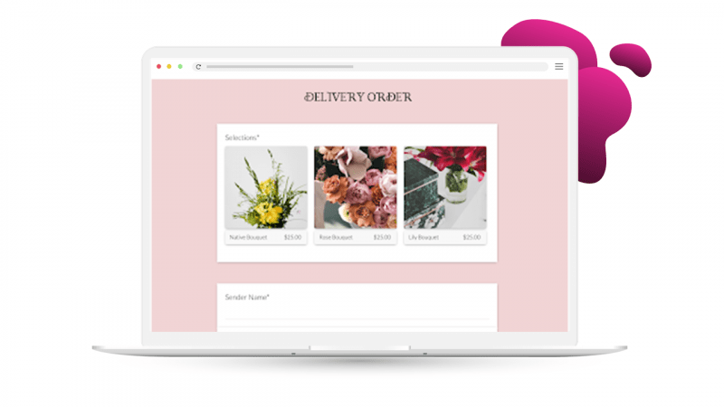
Choose a logical layout
Layout should also be taken into consideration when creating a form for your online store. The aim is to create a form that has a straightforward and intuitive layout, so it is easy for a consumer to complete. It is also important to recognize that customers will appreciate looking at something with a layout that makes sense.
When considering a form layout, try to think logically. It is good practice to put all related questions together, such as putting all contact information fields in one section. Furthermore, layout can play a huge role in how easy something is to read. Try to avoid leaving huge gaps between questions, or having them too close together.
Source: Paperform
3) Remove distractions
Another great way of enhancing eCommerce forms is by removing distractions. It is possible to achieve this through multiple different methods.
Enclosing the checkout web page is a popular way for eCommerce sites to keep users focused. This term essentially means you get rid of almost all of the navigational features whilst the customer is completing the form. Usually this is in the form of removing the site search bar and navigation bar. Generally, this method is used to increase conversions when users get to the final stage of making a purchase. However, it can easily be replicated for any eCommerce form – even if it’s not on the checkout page.
Removing elements that may cause a potential customer to click off the form means they are more likely to fill in all their details and complete the form. It reduces the concept of FOMO (fear of missing out) and prevents users from considering what else is on the site to look at.
Final thoughts
Ecommerce site forms are an excellent tool for any online shop, and they have a variety of uses and benefits. However, it is important to optimize them in order to get the best possible results.
Popovers are an effective way to present your eCommerce forms in a way that is engaging and unobtrusive. Popovers can be used to identify customers with data capture, encourage micro conversions such as newsletter sign-ups, and recover revenue with cart and browse abandonment messages. Discover 5 types of popovers that improve the customer experience.